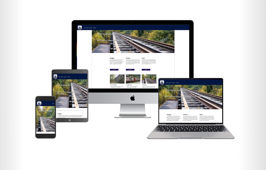
RESPONSIVE WEBSITE DEVELOPMENT
Responsiveness and Choosing the Right Agency
When the internet first came about, web development was relatively easy. A smattering of HTML, a bit of Perl, Javascript or PHP and your ideas came to life. In 2007, Apple blindsided that model with the development of the iPhone, the world's first smart phone. While Blackberry, Palm and other companies had the ability to view websites on their devices, modern smartphones changed the world forever increasingly offering higher resolution screens and offering full featured browsers.
Developers and agencies now had to contend with the concept of a user rotating a device and viewing an entire website on a screen rather than "keyhole browsing" (the concept of viewing the web as if peering through a small hole into a large room). Writing a single website code base that could adapt to all screen sizes (a responsive website) became the holy grail. To add more pressure, in 2009 many individuals (including us) were stating quite boldly that we predicted a time when the majority of web browsing would be done on smartphones rather than laptop or desktop computers. That day came sometime between mid 2013 and the beginning of 2014. Server logs now report that over 70% of all website traffic is using mobile devices, defined primarily as smartphones and tablets. These devices also added a number of technology features that did not exist on desktop systems like fine-grained location access, accelerometers and other types of sensors.
There are only two basic rules. First, every website must be capable of adapting to any size screen. This is not only necessary, it has to be a highly efficient process. The second rule is that there are absolutely no exceptions to rule number one (sometimes we feel redundancy is the best way to get a message across).
Does Responsiveness Affect SEO?
In one word, yes. By the middle of 2019 and Google and other search engines announced they would start scoring search engine rankings based primarily on the scores of the mobile versions of websites. If website owners do not adopt responsiveness, they start sliding backwards in search engine results. We have been helping website owners change their sites to be responsive and can put that knowledge to work for you.
The development focus we endorse is a concept referred to as "Mobile First Development". The concept involves architecting all aspects of a website so that that when a webpage is first requested, the accompanying layouts and assets are served for mobile devices by default. This saves bandwidth and network bandwidth and also ensures the smaller devices can render a web page quickly. Larger screens have the luxury of parsing the HTML model and requesting larger assets instead of the smaller ones to ensure good viewing experiences.
Speed Affects the Bottom Line
The stakes are high for business. Slow loads on mobile devices can cause consumers to go elsewhere. A non-performant, non-responsive website experience can cost you a customer's business. A 2019 Page Speed Report from Unbounce, a company specialized in building high-converting landing pages and popups for marketing campaigns, showed results from studying over 1,150 consumers and businesses. THe conclusions were that a poor customer experience due to a slow-loading page ona mobile device can have a deciding factor on your bottom line.
In an interview with Unbounce, SmalBizTrends.com, it was claimed that nearly 70% of consumers stated page speed impacted their willingness to buy. Furthermore, a slow loading time will not encourage a second visit to the same site. Based on analytics, over 22% closed the website. Most reported they would use a competitor and another 50% would tell others about the negative experience. Responsive designs affect any business' bottom line. Ask yourself, would you be reading this if the page tool 25 sconds to load?
Where do you start?
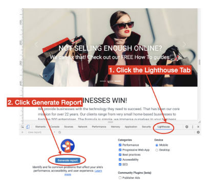
Always start with prior work on responsive websites. We highly urge all potential website customers to seek references to past sites agencies have created and evaluate them. This can be done easily using Google Chrome's Lighthouse tool. To see how well a website is built for mobile, do the following:
-
Open the website domain in Google Chrome.
-
Right click (Control-click on OSX) on the website within the browser and select "Inspect" from the content menu.
Alternatively, to open the developer console in Google Chrome, open the Chrome Menu in the upper-right-hand corner of the
browser window and select More Tools > Developer Tools.
-
When the developer console opens, click on the Google Lighthousetab (1), then click the Generate Report
button in the bottom pane (2).
- When the report is finished, review the scores. There are four scores that are telltale indicators of the skill
of the website designer and developer. These are Performance, Accessibility, Best Practices and SEO. I include designers in the evaluation
because they are often responsible for poor color contrasts or other failing visual elements.
- Of the four tests, the Accessibility score is often not the fault of the webmaster as clients and/or their designers often ask for font colors that do not have sufficient contrast to the background, hence generating a lower score. A good agency (like us) will inform you when such design decisions might affect your website's performance. Nevertheless, a score of above 80 in any category is considered "good". Anything close to 90 or above is very good. The test above is a real world result on this website, which we designed, developed and currently host. All three factors play an important part in the overall scores.


Site scores based on the Homepage of this website.
If your prospective web agency has not scored at least 90 points in the other three categories, our advice would be to ask why. Some are not even aware of the manner in which high quality websites are built. Our advice is to politely thank them for their time and then move on to another agency.
Other Considerations
A good agency will have at least three or four reference customers and sites for you to review. After running Google Lighthouse tests on the sites, start taking notice of the consistency and design features. Here are some key considerations:
- Are elements of pages consistent across the site?
- Resize the browser screen. Does the site render well on all different screen sizes?
- When you view the website on a mobile phone, does it display and function properly?
- Are their very clear and concise calls to action (CTAs)?
- If you view the site source, are there any errors in the development console (follow the same process as Lighthouse, above)?
- Does the site reflow well when you tilt your phone from vertical to horizontal?
- How long did it take for the website to load? Faster sites are better for business.
- Imagine yourself as a customer of that website. Can you find what you're seeking quickly?
Once you have finished reviewing their work, ask about the process. Any good agency will want to start by explaining the website development process. This often starts by immersing themselves in your business model to understand and document your business requirements. If the agency jumps right into "We can increase your SEO ranking" without even trying to understand what your website is supposed to accomplish, run away fast! Digital agencies should also be very transparent about how they construct responsive websites and what technologies they use. Many, like us, use a fairly standard set of frameworks like Bootstrap and jQuery however there are newer technologies that can do the same things. A good agency will explain the options along with the pros and cons of each. Solutions may range from WordPress to a completely custom site built in React.js. As a client, you should feel comfortable knowing that your agency has chosen the best technologies for your needs.
Our work often starts by questioning prospective customers to ask them some basic sets of questions. What is the purpose of your proposed website? What KPIs ofr other metrics for success will you use to evaluate it? What are the primary two to three items a user to your website should be called to do? At the end of a successful visit to your website, what is the end state? We use the answers to drive the next sets of questions.
Finally, review Google's statements on how responsive websites can affect your search rankings and discuss the article with your agency. If you feel they understand it well, you are probably in good hands.
If this seems overwhelming, you are not alone. Luckily, we offer a free initial consultation for all new clients so you have nothing to lose by using the contact form on this website. If you need more convincing, check out our customer testimonials or view the list of previous projects we have worked upon. Also be sure to check out our endorsements on LinkedIn.
Dont let your competition get a lega up on you. Make the call today.